The purpose of this blog is to practice preparing a project outline and brief similarly to the one I shall be following for my FMP in third year. I hope to use this as a chance to show a professional approach to this task. After researching several styles of project briefs (linked at the bottom) and looking at the briefs we have had to follow over the last two years I hope what I write will be appropriate.
The planning of a project is possibly the most important stage of creating a level or character. The brief is there to prepare you of the work ahead. It is used as a guide to follow and to be checked often, remember to always go back to your roots.
Brief
Project outlines
The aim of this project is to create a realistic 3D environment which is to include a lead character, NPC, Vehicle and any extra props needed. The final result must be as close to an "AAA" standard game as possible. The level must run efficiently on lab computers at a minimum rate of 30 FPS at 1080i support.
Aims:
- The final models must be highly detailed with minimal smearing and seams, however they must run smoothly in engine.
- Additional maps must be used to give your models the most realistic and effective outcome
- Topology to be used correctly and a sensible polygon/triangle limit in place.
- To follow the brief and tecnical specifications correctly.
Learning Objectives:
- To be able to work efficiently alone and to a deadline.
- To successfully work to a plan and show good time management.
- To ensure all models work efficiently within engine.
- To have working collisions on all assets.
- To use skills in Photoshop, 3DS Max and chosen engine proficiently.
Additional Information:
The audience must be considered and shown throughout the environment through assets and level design.
The Genre must be reflected throughout the level.
Technical Specifications:
Software:
- Photoshop
- 3DS Max
- Cryengine
(Optional)
- Mudbox
- Zbrush
- Crazybump
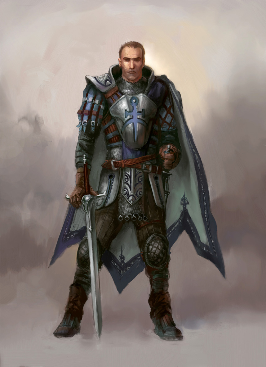
Lead Character:
- 25,000 Triangle limit
- Two 1024x1024 Colour Diffuse map + Additional Alpha
- Two 1024 x 1024 Normal/Specular and additional maps.
- Correctly rigged
NPC:
- Varies from 10-25,000 Triangles dependant on players interaction time.
- Two 1024x1024 Colour Diffuse map + Additional Alpha
- Two 1024 x 1024 Normal/Specular and additional maps.
- Correctly rigged
Vehicle:
- 10,000 Triangle Limit
- Two 1024x1024 Colour Diffuse map + Additional Alpha
- Two 512x512 Normal/Specular and additional maps
Environment and additional Props:
- Up to 200,000 Triangle Limit depending on density of props needed.
- LODs to be created sensibly
- Must run at 1080p resolution
- Must run at minimal 30 FPS rate.
Level must run smoothly and be appropriate for its audience. A flythrough and screenshots must be included alongside a design document to document the process of creation.
Links and references:
http://www.blitzgamesstudios.com/open-days/sample-briefs/
http://www.gamespy.com/game-specs.html
http://www.gamespot.com/forums/system-wars-314159282/tech-specs-of-killzone-sf-and-crysis-3-character-m-29419004/
Also research into our past project briefs and others we have received from industry.
Note: this blog will most likely be edited once I have access to Microsoft word again, so for now the brief is here but not formatted how I would like it to be.