One year gone, gosh that was fast! I suppose now is the moment to look back and recap over my first - and hopefully not last! Year of university.
So what about the course? I believe its the first time I have done something I actually really enjoy. I pretty much hated my life through all of school as all kids do. I have always had a passion for art but could never express it through GCSE or A level art as my teachers hated photographic or realistic art, its all about modern art and expressionism which caused many arguments and me getting into a fair bit of trouble. I knew I had made the right choice in choosing DMU from the very first open day I went to and the course most definately has not left me down.
Visual Design I have particularly enjoyed this year as it is everything about what I love - drawing. Ok, I hated the two character projects because I am awful at drawing people but that can be improved, but other than that it has been great. I feel like have been taught so much more than what I had been taught in school about perspective, tones and shape and have actually enjoyed it. Everybody has been friendly even if I have not been the most social of people but I have met some great people who I actually have things in common with. I mostly enjoyed being out and about most days, be it drawing or out with friends - especially the trips to Bradgate, but it is always nice to get out of the city for a while. The life drawing sessions have been incredibly useful in the improvement of my understanding of female anatomy however I would've liked to study the male body as well. It's all good being able to draw one but not so much the other.
I have never had any proper proper 3D software experience other than CAD back in year 7 and 8 so it was all very new, however the courses structure helped me improve these skills incredibly fast and I feel quite confident in my abilities in 3DS, now as for Photoshop, that's another issue... Hopefully I will learn more about working with Photoshop next year though.
I've also loved critical studies, even if I have been a bit... Ok, incredibly lazy with my blog posts. Writing has never particularly interested me, which probably seems an odd comment coming from one who studied English Literature. The main thing I think I would've liked to see more in Critical Studies is more presentations! I know this will pick up within the next couple of years but from my first presentation to my third I can feel that Improvement in my organisation and confidence, which I would love to keep building upon. Although writing is not my strong point I have enjoyed reading through articles and the research in general because I feel it gives me a much greater understanding into the course and the topic of gaming.
There isn't anything I can particularly think of to improve the course as it seems to be running perfectly well, I haven't heard a single negative comment on the structure or coursework (other than there's too much and we won't get it done in time, but that comes down to laziness and motivation, the third term seemed a lot slower than the first two.) However I cannot wait to -hopefully- start year 2 and improve myself further! Lets see what waits ahead shall we?
Monday 27 May 2013
Sunday 26 May 2013
Enviroment Design
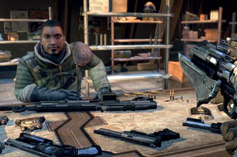
Every game starts with planning, including the creation of the games environment. This includes the art style of the game, how levels will be navigated and how each level will be decorated. The setting of a game is as important - if not more important than the plot and game play.
Collaboration on ideas is also incredibly important. The designers must be able to agree on something specific. Having some of the game set in a remote desert environment and the rest set in a frozen wasteland wouldn't make any sense. Everything should be exact and purposeful, it should fit the theme of the game and be easy to navigate. Collision meshes are used to stop people going into areas they shouldn't be able to get into, these are easy to make when the environment is inside a building or enclosed space because characters should not be able to walk through walls, however it is harder to emulate an end-zone when doing an outdoor environment however depending on the setting of the game you could create a reasonably realistic end of map area. For example, Far Cry 3, developed by Ubisoft is free roaming but ends with the ocean, which fits its island theme. Skyrim is mostly surrounded by mountains and games like Portal just have walls... or very big drops. The only game I could currently think of that doesn't seem to make realistic end zones are games like Silent hill where the road has a large crack to stop you passing - which is mysteriously cleared up after certain events, or tape across the road. In real life there would be nothing stopping you from passing, although I suppose I shouldn't be comparing a horror game with monsters and a "trapped" city to real life.

A games environment must also match its game play, you would expect a first person shooter to have a lot of objects placed in each map - places to hide, to scope and to take cover. You'd usually also expect a level of detail to fit the mood. Realism seems to give off quite a "serious" tone whilst puzzle games do not need the same level of detail, as it is not needed for the game play. The environments must mimic the tone of the game through its use of lighting and colouring. Child friendly games tend to consist of a lot of bright colours to keep them feeling happy, however a horror game would use darker and less saturated colours and specific lighting to try and give the player a feeling of fear and suspense. All of the above features give a game it's style.
Borderlands is a perfect example of a stylized environment which reflects the story and game play so well. The world of borderlands is created under a very specific style, it is almost cartoon-ish in its ways but still keeps its realistic roots. If a comic book could come to life this is how I would imagine it to look in 3d. The textures are a mix of both hand drawn and photographic, yet every object is surrounded by a border, making the environment fit its humorous genre. It also contains a lot of harsh shading/lighting and complicated level designs to keep its hectic and insane theme.

The maps are very expansive for exploration yet never seem to get repetitive nor boring, something i feel can happen with games such as Skyrim - where the environment is stunningly beautiful and realistic but repetitive and can get a bit dull.
Of course Borderlands was never originally designed to look how everybody now knows it. Gearbox head Randy Pitchford had proposed re-designing the complete art style of the game when the game was over half way through production. These changes were accepted and went ahead, as the original design didn't stand out from previous titles. I have to believe that Gearbox changed the style for the better, as the environments now feel very unique from anything else I had played.
Overall I feel a levels design has to be thoroughly planned to fit the games genre and story line. There is no point in creating large, beautiful scenes if there is no need to. Keep it small and precise, do not waste space, time or money on an un-needed area, to me a game seems more perfect when every detail is needed there and not there just because it could be there.
Collaboration on ideas is also incredibly important. The designers must be able to agree on something specific. Having some of the game set in a remote desert environment and the rest set in a frozen wasteland wouldn't make any sense. Everything should be exact and purposeful, it should fit the theme of the game and be easy to navigate. Collision meshes are used to stop people going into areas they shouldn't be able to get into, these are easy to make when the environment is inside a building or enclosed space because characters should not be able to walk through walls, however it is harder to emulate an end-zone when doing an outdoor environment however depending on the setting of the game you could create a reasonably realistic end of map area. For example, Far Cry 3, developed by Ubisoft is free roaming but ends with the ocean, which fits its island theme. Skyrim is mostly surrounded by mountains and games like Portal just have walls... or very big drops. The only game I could currently think of that doesn't seem to make realistic end zones are games like Silent hill where the road has a large crack to stop you passing - which is mysteriously cleared up after certain events, or tape across the road. In real life there would be nothing stopping you from passing, although I suppose I shouldn't be comparing a horror game with monsters and a "trapped" city to real life.
A games environment must also match its game play, you would expect a first person shooter to have a lot of objects placed in each map - places to hide, to scope and to take cover. You'd usually also expect a level of detail to fit the mood. Realism seems to give off quite a "serious" tone whilst puzzle games do not need the same level of detail, as it is not needed for the game play. The environments must mimic the tone of the game through its use of lighting and colouring. Child friendly games tend to consist of a lot of bright colours to keep them feeling happy, however a horror game would use darker and less saturated colours and specific lighting to try and give the player a feeling of fear and suspense. All of the above features give a game it's style.
Borderlands is a perfect example of a stylized environment which reflects the story and game play so well. The world of borderlands is created under a very specific style, it is almost cartoon-ish in its ways but still keeps its realistic roots. If a comic book could come to life this is how I would imagine it to look in 3d. The textures are a mix of both hand drawn and photographic, yet every object is surrounded by a border, making the environment fit its humorous genre. It also contains a lot of harsh shading/lighting and complicated level designs to keep its hectic and insane theme.
The maps are very expansive for exploration yet never seem to get repetitive nor boring, something i feel can happen with games such as Skyrim - where the environment is stunningly beautiful and realistic but repetitive and can get a bit dull.
Of course Borderlands was never originally designed to look how everybody now knows it. Gearbox head Randy Pitchford had proposed re-designing the complete art style of the game when the game was over half way through production. These changes were accepted and went ahead, as the original design didn't stand out from previous titles. I have to believe that Gearbox changed the style for the better, as the environments now feel very unique from anything else I had played.
Overall I feel a levels design has to be thoroughly planned to fit the games genre and story line. There is no point in creating large, beautiful scenes if there is no need to. Keep it small and precise, do not waste space, time or money on an un-needed area, to me a game seems more perfect when every detail is needed there and not there just because it could be there.
Subscribe to:
Posts (Atom)